
How to Convert MP4 to MP3 Free (In Your Browser)
A step-by-step guide to convert MP4 to MP3 free in your browser, with the right bitrate and no uploads.
Read articleA practical guide to design for color blindness, with the rules that matter and how to test your work using a free simulator.

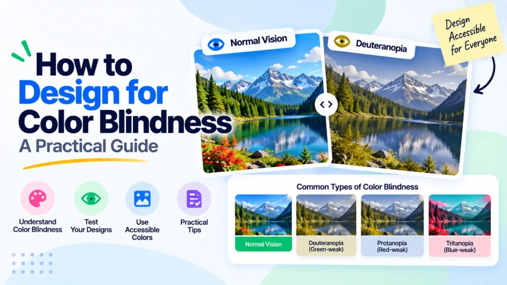
About 1 in 12 men and 1 in 200 women see color differently, so a red-versus-green status dot or a color-coded chart can be invisible to a real slice of your audience. Learning how to design for color blindness is not about dull palettes, it is about making sure meaning never rides on color alone. This guide covers the rules that matter and shows you how to check your work with the free Pixellize color blindness simulator.
To design for color blindness, make sure every piece of color-coded information has a second cue, then test the result. Add labels, icons, or patterns so meaning does not depend on hue, keep contrast high, limit your palette, and simulate the design across the main vision types before you ship. Those four habits cover most cases.
| Rule | Why it matters |
|---|---|
| No color-only signals | Red or green alone is lost to many viewers |
| Add labels and patterns | Meaning survives any kind of vision |
| Strong contrast | Helps low vision and color blindness together |
| Small palette | Fewer colors, fewer clashes to check |
| Simulate before shipping | Catches issues your own eyes miss |
This is the single most important rule. Wherever color carries meaning, a share of users will miss it. A form field that turns red for an error needs an error icon and a text message too. A line chart with red and green lines needs labels on the lines or different dash styles. The WCAG “Use of Color” guideline makes this a formal requirement, not just a nicety.
Here is the thing: adding a second cue almost never hurts the design for everyone else. A checkmark next to “success” reads faster than green ever did, even for people with typical vision.
When color separates data, back it up with texture. Charts can use hatching, dots, or dashes so each series stands apart in grayscale. Maps can add borders or labels. Buttons can pair color with an icon and clear text. These four habits keep a design readable for every kind of vision.
Rules only get you so far. The real check is seeing your design through color-blind eyes, which is what a simulator does. Export a screenshot of your interface, chart, or poster, drop it into the Pixellize color blindness simulator, and switch between vision types. If a red alert vanishes under deuteranopia, you know exactly what to fix.
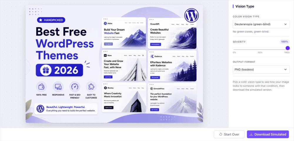
The first time I ran a dashboard through the simulator, a green “healthy” badge and a red “down” badge looked nearly identical under protanopia. That is the kind of gap you cannot spot by eye. Pixellize runs the simulation on your device, so unreleased mockups never touch a server.
The main types are red-weak and green-weak vision, which together cover most cases. Deuteranopia (green-blind) and protanopia (red-blind) affect the red-green range, tritanopia affects blue-yellow and is rarer, and achromatopsia is total color blindness. Design for the red-green types first, since they are by far the most common, per Colour Blind Awareness.
Color blindness is not rare. Around 300 million people worldwide have some form of it, which is more than the population of most countries. If your product uses color to show status, progress, or categories, a meaningful part of your audience is guessing. That is lost signups, missed errors, and charts nobody can read.
There is a business case too, not just an ethical one. Accessible design reaches more people, ranks better, and lowers support load because fewer users get stuck. Knowing how to design for color blindness is a small skill with an outsized payoff, and Pixellize keeps the testing part free so there is no excuse to skip it.
Some color pairs are safer than others. Blue and orange is a classic accessible combination, because it stays distinct across almost every type of color vision. Blue and red also work well. The pairs to watch are red with green, green with brown, and light green with yellow, which collapse into similar tones for red-green viewers.
Think of your palette like a small toolbox: a few well-chosen, high-contrast colors beat a rainbow every time. When you must use a risky pair, lean on shape and labels to carry the meaning, then confirm it holds up in the Pixellize simulator. Do not trust a palette just because it looks fine to you.
When the simulator reveals a problem, you have three quick fixes. First, add a non-color cue, an icon, a label, or a pattern, so the signal no longer depends on hue. Second, swap one color in the risky pair for a safer one, like moving green to blue. Third, push the contrast so the two elements differ in lightness, not just color.
Re-test after each change. A fix that looks right to you might still fail under a different vision type, so run it back through Pixellize until every type reads clearly. This loop, test, fix, re-test, is the whole practice of how to design for color blindness in action.
Live-page browser extensions are handy, but a lot of design work happens before anything is live. A Figma frame, an exported chart, a social graphic, or a slide is just an image at that stage. That is where an image-based check shines: export a PNG and drop it into the simulator, no staging site needed.
This also keeps client work private, since the Pixellize simulator processes the image in your browser and never uploads it. You can vet a confidential mockup or an unreleased brand asset without it leaving your machine, which matters when the design is under embargo.
Designing for color blindness is mostly a habit: add a second cue, keep contrast, and test. Start with your highest-traffic screens, since a fix there helps the most people, then work outward to the rest of the product over time. Pixellize keeps the testing free and private, and pairs well with the rest of the kit like the black and white converter for a quick grayscale contrast check and the image tools when you are prepping assets to share.
Preview any image across 8 vision types, free and in your browser.
Open the Color Blindness SimulatorTest it by simulating color blindness on a screenshot of your design. Upload the image to a color blindness simulator, switch between vision types like deuteranopia and protanopia, and check that every color-coded signal still makes sense. If a status or label disappears, add a non-color cue like an icon or text.
Avoid pairing red with green, since red-green color blindness is the most common type. Also avoid green with brown, blue with purple, and light green with yellow. Instead of removing colors, add a second cue like a label or pattern, or swap green for a blue that most people can distinguish clearly.
Deuteranomaly, a reduced sensitivity to green, is the most common type, followed by other red-green deficiencies. Together, red-green color blindness affects about 1 in 12 men and 1 in 200 women. Blue-yellow (tritan) types and total color blindness are much rarer, so design for red-green first.
In many contexts, yes. Accessibility standards like WCAG, which back laws such as the ADA and the European Accessibility Act, require that color is not the only way information is conveyed. Meeting that guideline is the baseline for accessible design, and it also improves clarity for every user.
Yes. Take a screenshot of your page and upload it to the free Pixellize color blindness simulator, which previews 8 vision types in your browser with no signup. For live pages, browser extensions can also simulate color blindness, but a screenshot test is the quickest way to check a specific design.
No. Adding non-color cues like labels, icons, and patterns usually makes a design clearer for everyone, not just color-blind users. A checkmark reads faster than a green color, and a labeled chart is easier for all viewers. Good color-blind design is simply good, readable design.
Founder and CEO of Pixellize.io, building AI-powered web tools and digital products with a focus on user experience and automation. M.Sc. Zoology, working at the intersection of technology, data analytics, and life sciences.