
How to Find Broken Images on a Website (Free Checker)
A broken image is one of those faults you stop seeing on your own site. The gray placeholder box, the missing product…
Read article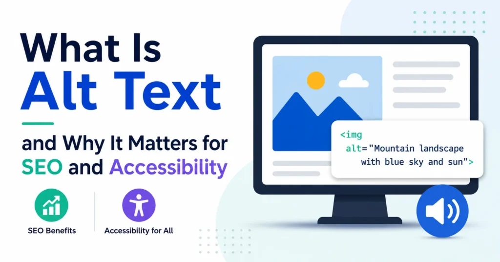
Every image on a website needs a short written description. That description is called alt text, and it does two things at once. It tells screen readers what the image shows so blind and low-vision users can follow along. It also tells Google what the image is about so it can rank your page in Image Search and feed visual context into AI Overviews. Both audiences read the same line of text. Both depend on you getting it right.
The trouble is, most sites still leave alt text empty. According to the WebAIM Million 2026 study, 53 out of every 100 home pages have at least one image with missing alt text. That is more than half the web. This guide walks through what alt text is, why it matters now more than ever, and how to write it well, with concrete examples you can copy.
alt attribute.alt=""; a link or button describes its action.Alt text is a short text description attached to an image in the HTML of a page. It lives inside the alt attribute of an img tag, like this:
<img src="cat.jpg" alt="Gray tabby cat asleep on a blue couch">
You never see this text on the page. It is hidden inside the HTML. It only surfaces in three cases: when a screen reader reads the page aloud, when the image fails to load (the alt text appears in its place), or when a search engine indexes the image for its results.
People often confuse alt text with the image caption or the file name. They are different. The caption is the text that appears below the image for everyone to see. The file name (like IMG_3892.jpg) is just storage information. Alt text is the only one that screen readers and Google actually rely on.
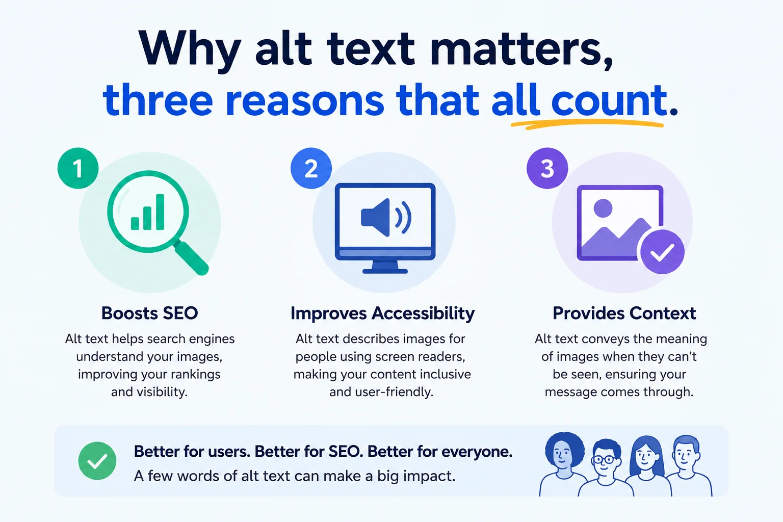
People who are blind or have very low vision use screen readers, software that reads text aloud or sends it to a Braille display. When the screen reader gets to an image, it reads the alt text. If the alt text is missing, it reads the file name (often gibberish like “I M G underscore 3892 dot J P G”) or simply says “image” with no context. Either way, the user misses what your page is trying to say.
That is the accessibility argument. It is the reason alt text exists in the first place. About 2.2 billion people worldwide have some form of visual impairment. Even if only a small percentage visit your site, they should not be locked out of half your content because you skipped a sentence.
The second reason is search engine optimization. Google’s image-recognition models are good, but they still rely heavily on alt text to confirm what is in a picture, as it explains in its Google Images SEO guide. Google uses alt text to:
The third reason is the most boring and the most overlooked. Images break. Slow connections, broken hosts, blocked file types, weird email clients. When an image fails to load, the browser shows the alt text in its place. Without alt text, users see a broken icon and zero context. With it, they at least know what they missed.
If you have never heard a screen reader, here is what happens. The software moves through the page top to bottom, reading every text element out loud. When it hits an img tag, it pauses and reads the alt text as part of the sentence flow. Then it continues.
That means your alt text should sound natural when read aloud. A user listening might hear something like: “Article title comma five reasons to learn JavaScript period. Image comma laptop screen showing a code editor with a JavaScript file open period. Paragraph one comma…”
Notice the screen reader does not say “image of”. It just says “image”, then reads your alt text. So writing “Image of a laptop” in your alt produces “Image image of a laptop” which sounds awful. Skip the prefix.
To write good alt text, describe the image’s meaning and function in one specific sentence under 125 characters. Skip “image of”, match the page context, use natural language, and never keyword-stuff. If the image is purely decorative, leave the alt attribute empty so screen readers skip it.
Good alt text follows a few simple rules. Stick to these and you will be ahead of almost every site on the web.
The fastest way to learn is by comparing examples. Here are a few common cases.
| Image | Bad | Better | Best |
|---|---|---|---|
| Product photo | wallet.jpg | black leather wallet | Black leather bifold wallet with brass snap closure |
| Marketing chart | chart | sales by quarter chart | Bar chart showing sales rose from 12k in Q1 to 38k in Q4 2025 |
| Team photo | team | Pixellize team standing together | Pixellize team of six in front of a brand wall, smiling at camera |
A product photo of a black leather wallet:
alt="wallet.jpg"alt="black leather wallet"alt="Black leather bifold wallet with brass snap closure"A graph in a marketing report:
alt="chart"alt="sales by quarter chart"alt="Bar chart showing sales rose from 12k in Q1 to 38k in Q4 2025"A team photo on an About page:
alt="team"alt="Pixellize team standing together"alt="Pixellize team of six people in front of brand wall, smiling at camera"Not every image carries meaning. Some are pure decoration, a swirl divider between sections, a background pattern, an icon that sits next to text that already says the same thing. For these, you do not want a screen reader announcing “decorative swirl image” every time it reaches one. That is noise.
The right move is an empty alt attribute, written as alt="". This tells the screen reader to skip the image entirely. The W3C’s alt text decision tree is the authoritative reference for deciding when an image is decorative. Do not remove the attribute. Do not write alt="decoration". Just leave it empty.
A good rule of thumb: if you can remove the image and the page still makes sense, the image is decorative and the alt should be empty. If removing the image leaves a gap in the meaning, write proper alt text.
Accessibility guidelines, and WCAG Success Criterion 1.1.1, sort images into a few types, and each one needs a different approach. You have already seen informative images (write a description) and decorative images (empty alt). Three more types trip people up.
| Image type | What to do | Example alt |
|---|---|---|
| Informative | Describe the meaning in one sentence | Gray tabby cat asleep on a blue couch |
| Decorative | Empty alt so screen readers skip it | alt=”” |
| Functional (link or button) | Describe the action, not the look | Search |
| Image of text | Repeat the exact words shown | the text in the image, verbatim |
| Complex (chart, map) | Short alt plus full data in the body | Bar chart of sales, described below |
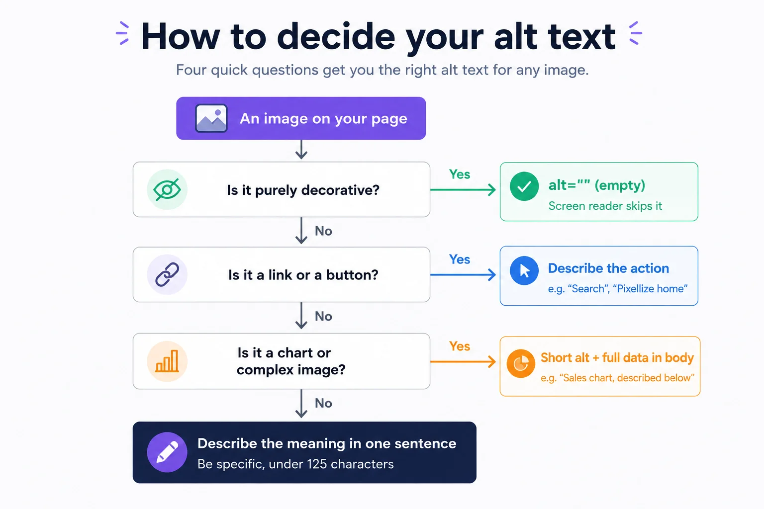
When an image is a link or a button, the alt text should describe what it does, not what it looks like. A magnifying-glass icon that runs a search gets alt="Search", not alt="magnifying glass". A logo in the header that links home gets alt="Pixellize home". If the image sits next to visible text that already says the same thing, the image is redundant, so give it an empty alt="" and the link is not announced twice.
Text baked into an image (a quote graphic, a price on a banner, a button label saved as a JPG) cannot be resized, recolored, or selected, and it fails low-vision users. Use real HTML text whenever you can. When you truly need text inside an image, the alt attribute must contain the exact same words, character for character, so screen reader users get the identical message.
A chart or infographic carries more information than a 125-character alt can hold. Give it a short alt that names what it is and points to the detail, for example alt="Bar chart of quarterly sales, described below", then put the actual numbers in the body text, a data table, or a linked long description. The body-text route is best: it helps every reader, not just screen reader users, and Google can index it too.
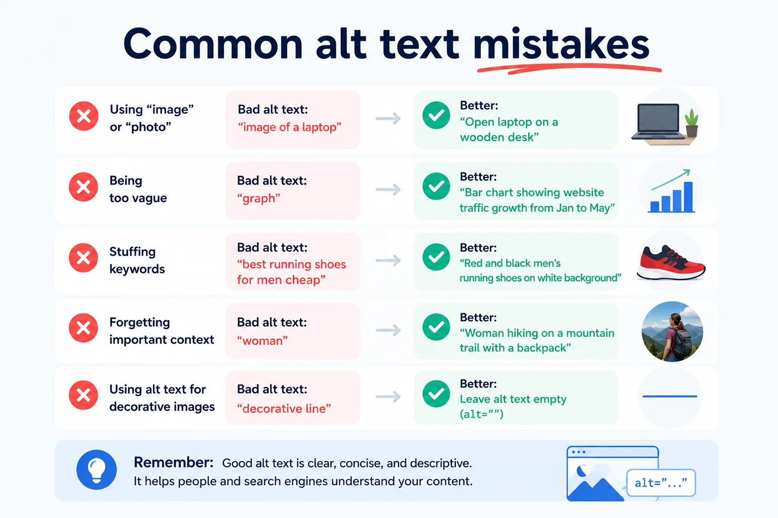
After working through hundreds of sites, the same problems show up again and again.
alt attribute at all. Screen readers fall back to the file name, which is usually meaningless.DSC_5821.jpg as the alt when you upload. That counts as having alt text technically but provides nothing.alt="shoe" tells Google your page is generic and tells users nothing.alt="cheap red shoes buy red shoes online discount red shoes free shipping". Google ignores it. Screen reader users hate it.WordPress makes it easy, you just have to remember to do it. There are three places where alt text shows up:
One small habit fixes most missing alt text problems. Whenever you upload a new image, fill in the alt text right then, in the Media Library, before you do anything else. It is the single most useful thirty seconds you can spend on a post.
If your site has more than a handful of posts, opening each one and reviewing alt text by hand is unrealistic. The Pixellize Image Alt Checker can scan any page on the web and list every image, telling you which have alt text, which are missing it, and which look auto-generated.
Paste a URL, hit check, and you get a clean report. It runs entirely in your browser, so your URLs and the scanned content stay local. Use it for your own pages, your competitors’ pages, or any reference site you want to audit.
Scan any page for images missing or empty alt text, free and in your browser.
One more thing worth being honest about. Alt text is not a place to:
Writing alt text is one of those rare web tasks that costs almost nothing and pays off in three different places at once. Screen reader users get a real page instead of a wall of “image image image”. Google understands your visual content well enough to rank it. Even your sighted users get a fallback when an image fails to load. The cost is a thirty-second pause every time you upload a picture. The benefit compounds for as long as the page exists.
Want to know how your existing pages are doing? Run them through the Image Alt Checker. It will tell you in seconds which images need attention. Fix the worst offenders first, then make alt text part of your normal upload routine going forward.
Under 125 characters, roughly fifteen words. Most screen readers cut off after that. If your image needs more explanation, put the extra detail in the surrounding paragraph or caption.
If your target keyword fits naturally, use it once. If forcing it makes the description weird, leave it out. Natural language beats keyword stuffing.
Use an empty alt attribute, written as alt="". This tells screen readers to skip the image, which is the right behavior for purely decorative pieces.
AI tools give a good starting point by identifying objects and scenes. They cannot know why the image is on your specific page, so you still need to edit the output so it fits the context.
In many countries, public sector and large commercial sites must meet accessibility standards (WCAG), which include alt text. In the US, the ADA has been applied to websites in multiple court rulings.
No. The title attribute shows a hover tooltip and is mostly ignored by screen readers. They read the alt attribute. Always use alt, treat title as optional.
A caption is visible text below the image, for everyone. Alt text lives in the HTML and is read by screen readers, search engines, and shown when images fail to load. They serve different audiences.

Founder and CEO of Pixellize.io, building AI-powered web tools and digital products with a focus on user experience and automation. M.Sc. Zoology, working at the intersection of technology, data analytics, and life sciences.